Improved user experience for our website monitoring client
We published new web application with improved UX and some new useful features:
- you can now quickly filter your checks on “Live status” screen:

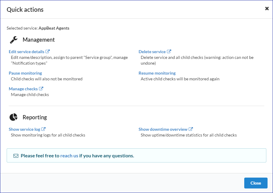
- added quick actions for monitored checks and services

- “Live status” simplifications due to new quick actions feature
- Check wizard should now have better support for high DPI displays and show vertical scrollbar where needed
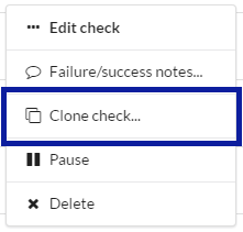
- Added option to easily clone monitored check (this allows you to quickly create similar monitors)

- “Live status” - dismiss all alerts is displayed when there is more than one service alert. Previously you had to click “dismiss alert” for each monitored service.
- new API methods: added dismiss-service-alert and dismiss-all-service-alerts endpoints
- other minor improvements & optimizations
If you find any issue please let us know.
Happy monitoring!
Read other posts